Monday 19 September 2011

Recharging the creative batteries

In times of so much doom and gloom on the news, and the gleeful negativity of the presenters – everyone needs to recharge their enthusiasm and positive energy – that is what the summer is for.

For me recharging the creative batteries is also vital and is a constant process. It is a combination of keeping up with their current creative trends, being inspired by other designers and the approaches, meeting up with friends. This is the day-to-day stuff and is what any good designer does.

Every designer also has their own personal inspiration, personally, it has always been music and live music. The complete immersion in the sound, the light, the energy of the performers and the energy of the crowd for me is truly inspirational.

This summer I have once again been to The Galtres Festival, North Yorkshire, with my daughter. Three days of music, mixing with like-minded festival-goers and being part of a collective crowd sourced enthusiasm. A festival is a way of seeing bands you have never seen or heard before, meeting and making new friends and allowing your soul to be inspired.

For me the inspiration is all this music and the smile on my daughter’s face and knowing she has got the same bug! 

Tuesday 12 April 2011

The Rise of the Indie

Over the last year there has been a huge increase in Indie publishing, authors who want to publish themselves for the commercial market. Here at 2h Design we have been apply our years of experience in mainstream publishing to Indie projects.

The old adage of never judge a book by its cover was obviously coined by someone who has no idea how publishing works. 
Readers used to only browse for books in shops, now they can scroll through hundreds of books online and the preview of the cover now has to work not only at the size of a printed book - but also in a thumbnail the size of a postage stamp. The importance of the professionalism of the cover and indeed the entire book is vital because for an Indie publisher to compete with the mainstream publishers they must be as good or better.
2h Design not only has over 25 years of experience working in publishing, we also work with other industry professionals, from editors to printers, proof readers to publishing PR. We are now doing a lot of work where we help Indie publishers project manage every element of the process of taking their project to publication date.
We also work on the principle - if we can't help, we usually have a contact who can.

Bookmark and Share

Friday 29 October 2010

A truly international project

The World is definitely shrinking


Autumn and winter Yorkshire can sometimes feel cold, dark and very long, sometimes starting in September and going right through to the end of the following August.


Recently I have been working on a project which has transported me to the heat of Thailand and Australia. I have been working with Simon Royle, based in Thailand, on his thriller, Tag, set 100 years from now. We have been speaking over Skype where, as the wind whistles round my studio, I can hear the cicadas and the occasional frog. Simon gave me creative carte blanche which is always a generous act where, as the author, he is so close to the project. One of the challenges of this cover is that as it will be both an ebook and printed book the cover has to work both for print and as a very small preview image in online stores.


After we had discussed the initial concepts Simon put me in touch with a very fine photographer Markus Summerer, who has produced the wonderful image for the cover. Markus has been great to work with, very open to suggestion and then adding his own spectacular creativity.


We started by having a long discussion giving me the chance to get under the skin of the project. Following this I came up with some different concepts which again we discussed over Skype. Markus, based in New South Wales, Australia, then produced a variety of images based on the agreed concept. We then reviewed these and asked for a couple of revisions which were turned round in a few days. We were very lucky that he produced 3 images all of which could have been used. In the end we chose the one seen above.


The ability to talk and work across such vast distances and time zones in some ways seems to reflect the spirit of the book. I look forward to further intercontinental collaborations. I am pleased to say that Simon is happy with the results as well


And now it is back to the autumn in the UK and starting work on the typography for the print version of the book. You can keep up with Simon's blog and writing at http://www.simon-royle.com/


Bookmark and Share

Saturday 22 May 2010

Pip - Designers Dog 2

*


Good morning all. I am Pip the Designers Dog. I have been living with Ned the Designer, Alison the Mosaic artist and Katy the schoolgirl for around 3 months now. I have been training to fill the big paws of Mac the Designers Dog who sadly died earlier this year.


Well I have got the basic grasp of book design and book cover design. I watch Ned the Designer staring at his computer screens and moving pictures and words around until they look good. I am also in the process of learning other skills as well that I need to work with The Big Ideas Collective, Ned the Designers other company.


I have my own Twitter account - until I came here I thought Twiitter is what birds do - But no - I tweet about things going on here.


This week Ned the Designer has been working on a couple of book projects for BlueRed books one on Icons and one on Events that changed the World. He has also been designing covers for plays for Nick Hern Books (which he has been doing for years) This week it has been covers for RSC, Tricycle Theatre, Everyman Theatre, Chichester Festival. He has also been doing some work with a Makaton signing project, Interactive CD covers for the University of York


For the Big Ideas Collective he has also been planning a project which he is presenting next week. He has been doing things called mind maps. He has also been planning for next weeks meetings and some work for Fern Manor (maker of Garden Retreats).


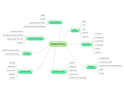
- so not to be outdone - here is my own breakdown - click on the map to see the detail.


…and Ned the Designer thinks he's been busy - this is my DAILY schedule.

Well that's about it for now - this schedule is 24/7 - I think I am about to going into the sleeping phase

*The photo above is me with Ned the Designer


Bookmark and Share

Sunday 28 February 2010

Where did the first 2 months of the year go


The first 2 months of 2010 have just shot past. Lots of new business and new opportunities - so different from last year. With the improvements we have made to our internal systems 2h has expanded its capacity for publishing work, consequently we are looking to take on more publishing projects from our existing clients and looking forward to working with some new publishers and authors as well. We have posted our new portfolio presentation which shows a variety of 2h Design's book and cover work.  


I was lucky enough to have a trip to New York with Out-Take publishers to work with Michael Halsband on the pre-production for a book. I was also lucky enough to have Michael take my portrait (see below). Over the 4 days we must have gone through about 16,000 images and selected around 1500 in the first edit. More news as it happens. We have also worked with Michel Lafon Publishers to supply the files for Tunnels website for them to make a French version of the site - designed by 2h and expertly developed by Simon Bolstridge at Squeegee Design.


Type and lettering are so strongly part of Upper Eastside Manhattan I was staying in - very inspiring.


Next blog I will be putting together a list of useful things self publishers can do to make their book compete with the mainstream publishers. 


In the meantime if you have a publishing project you wish to discuss with 2h design please get in touch


Bookmark and Share

Sunday 6 December 2009

Diary of a designer's dog 4


Christmas is coming…


This is my second Christmas – I like Christmas - lots of walks with the family, both Ned the Designer and Alison the Mosaic Artist take time off and Katy is off school. 

Looking to next year, Ned the Designer already has some exciting projects in place, another Ray Mears book for Christmas 2010 so probably more camping for me - woooohooo!! There are also a couple of projects he is not allowed to talk about yet but as soon as I get more information I will let you know.

He is also looking to develop both of his businesses having gone through the recession this year, to be honest not too sure what a recession is - but it has been on the radio a lot in his studio and you just can't help picking these things up.

For 2h he is looking to increase the number of publishing projects. He wants to design more books, book covers and marketing/promotion for books. Hmmmm - I wonder if this means I will be doing research like for the Ray Mears work. Could be interesting.

He is also looking to build the Big Ideas Collective further along with the rest of the team. BIG does something called creative communications to help their clients develop their businesses. He has been going to loads of meetings recently and there are quite a few things on the job schedule for next year. He has also been working with one of BIG's clients, Our Celebration, to develop a brand for the York Year of Volunteering. To find out more about this click here.

So all that remains is for me to wish you all a really great Christmas and New Year break - and hope you get to go out on lots of walks too.

Mac


Bookmark and Share


Wednesday 25 November 2009

An interview with Ned by Gary @Bubblecow - part 3

Here is the final part of an interview done for Bubblecow's company newsletter - Bubblecow provides professional editorial services needed to help lift a book to a publishable standard


Can you enlighten us a bit on the technology side?

The technology for design and production has improved out of recognition from when I started. At Sphere all our initial work was traced and all visuals hand painted. Now with the amazing software available a rough can look pretty much like a final cover. A common misunderstanding of the technology is that the software can make everyone a designer. This is not the case, a designer spends four years at college and all their working lives developing their visual creativity and understanding how to get a message across through the combination of type and image. The software, when used right, is just a smart pencil - you still need the ideas and knowledge to communicate. That said, the technology and software means that a designer can be far more picky about the typography and detailling of a project than when the text was cast off to fit a certain page extent. 

The two standard packages are QuarkXpress and Adobe InDesign both of which are very good and produce the files that the printers need for printing. My personal preference is InDesign as there are some very neat tricks when creating long complex books, like auto re-pagination and it is really easy to integrate with Photoshop and Illustrator.

I also work on many international editions that require specific production requirements to make the foreign languages economic to print.  This involves keeping the text as a spot colour so all the images do not have to be re-originated every time the book is reprinted.


Finally, what kind of input do you like from writers?
Enthusiasm and a commercial vision, the writing process is a gruelling one and sometimes it is hard to sustain the energy through to the production and marketing stage. It is important to sustain the creative energy through to the launch and marketing of the printed book. The really successful writers are those who realise that for their book to reach an audience there is a lot of work after the last full stop has been put in place. 

A recent self-publishing venture Benedict's Brother by Tricia Walker, Tricia completed the manuscript and handed over for design and then worked every hour available to market and launch the book and succeeded in securing a launch at a local bookshop and a lot of local press and PR coverage. She sold in excess of 200 books on the launch night itself and has reprinted. I also worked with Roderick Gordon and Brian Williams on their first self-published venture called the Highfield Mole - this sold out and they were subsequently signed up by Chicken House who re-published a revised edition called Tunnels which has gone international selling through Scholastic in the US. They are now three published books into their series. Both of these projects the authors had a very clear idea of the commercial requirements to make their books to compete with all the other books on the book store shelves.

What can they do to make you job easier?
To have a clear idea for who they are writing for - the more specific the more targeted and effective the cover can be. Finally to be willing to step back from their role of writer and to be objective about the possible cover directions. 


Many thanks to BubbleCow for allowing reproduction of this interview


Next post will be more from the Diary of a Designer's Dog

Bookmark and Share